CASE STUDY
Turning a homemade healthcare coaching site into
an authoritative and credible, high-ticket brand
The Challenge
Let’s Lead is a woman-owned consulting firm that helps hospital executives and clinician leaders break out of siloed, adversarial working relationships and build real partnership — the kind of work that requires trust to be present before the first conversation even happens.
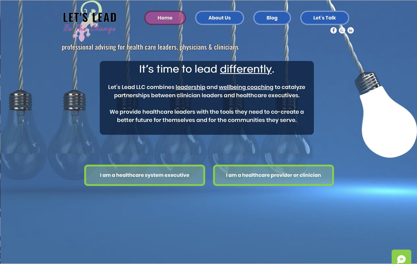
Like many startup sites, the original had been built without professional design or strategic copy behind it: the logo had come from a clipart library, visuals were either generic stock imagery or photos that jarred with the concepts the site was articulating, and the messaging didn’t reflect the caliber of the coaching being sold. For a consulting practice charging premium rates to work with hospital leadership, the site read less like an authority in healthcare leadership and more like a weekend side project — and it was quietly undermining credibility before a single call was booked.
BEFORE...
Strategy first. Copy second. And a design built around both.
As with all Two Eye Copy projects, before diving into a rewrite I started with keyword research to understand this industry as well as how healthcare executives and clinician leaders were actually searching for the kind of leadership and wellbeing coaching Let’s Lead provides—if at all. I had to consider the very real possibility that executives at this level were not searching at all, but relying on word of mouth and referrals instead. This research shaped everything downstream: which pages the site needed, how they were organized, and the language used to talk about the offer — so the site could earn visibility with the right audience, not just look better to visitors who already knew the brand.
Ordinarily, I stand firm on not using industry jargon or overly complex terminology. In this case, the opposite was true. Since this site is targeted to a specific niche with a specific need in a specific industry, using phrases and language that only they understand was necessary. This was not a situation that called for the simplest language to appeal to people without intimate knowledge of the industry and its challenges.
01. KEyword REsEarch
This gave me the words and phrases that healthcare clinicians and hospital leaders, use, understand, and search for.
02. SitE ArchitEcturE
Deciding on key site pages, how they'd be organized, what each one's purpose would be, and how visitors would move through them was the next step.
03. BraNd DEVELOPMENT
A brand foundation (voice, tone, style, personality) was needed to guide copywriting and to give design partners a clear brief to work with. Now, whenever Lets Lead needs marketing, video, ads, or other content, the creative team have clear guidelines.
04. Copywriting
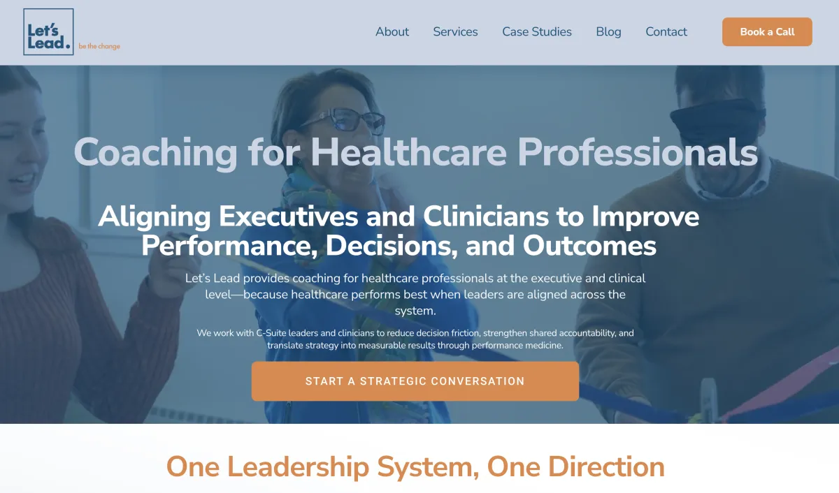
With the keywords, site architecture, and brand fully developed, now it was time to translate it all to a clear, credible narrative. On-page copy needed to speak directly and engagingly to hospital executives and clinician leaders.
AFTER...
SUPPLEMENTAL PROMOTIONAL MATERIALS
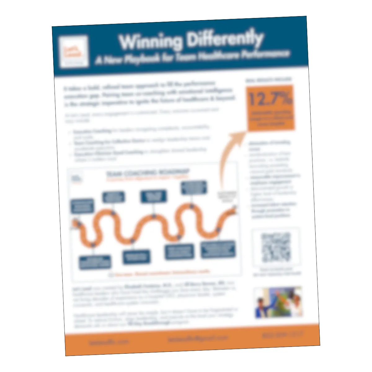
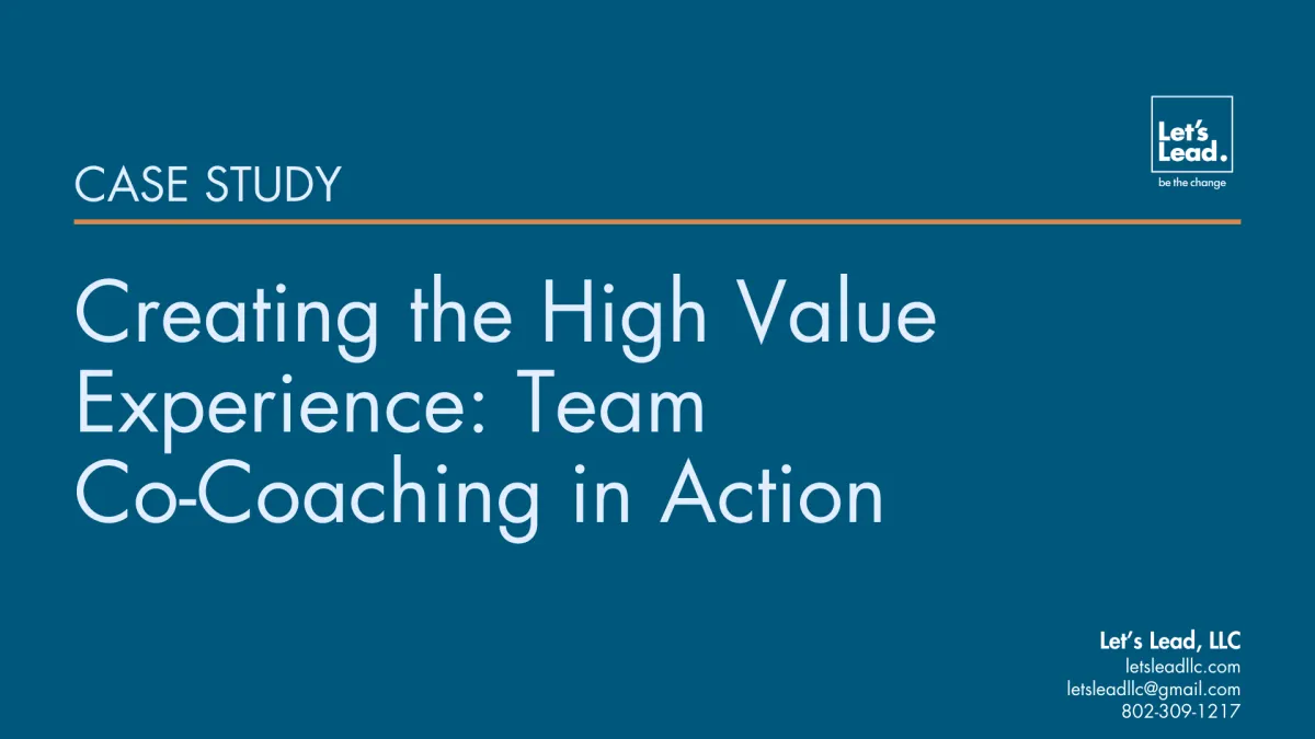
The client needed additional materials for lead generation, proposals, and for prospective client team discussion. Once the graphic designer had created a visual brand kit with new logo, brand fonts, and color palette, I was able to create an on-brand onesheet and downloadable case study to be used in different applications.
MARKETING ONESHEET
DOWNLOADABLE CASE STUDY
As the business grows, Let's Lead has all the elements it needs to scale their marketing without straying "off-brand."
I'm so excited to see what the future holds for this truly unique consultancy!
Proud alum of Queen City BNI
All Rights Reserved – Two Eye Copy | Liisa Reimann Copywriting, LLC